As the evenings close in, drawing the curtains and sitting cosily in a room lit by soft lamplight can induce feelings of contentment, and if your colour scheme suits the season of earthy, warming tones, all the better.
We’re now fully immersed in the rapid descent into winter and for home styling enthusiasts looking for a change of look and to warm up their interiors, Lesley Kelly, interior designer and colour consultant at 5th Wall Interiors, says autumnal colours can be introduced seamlessly.

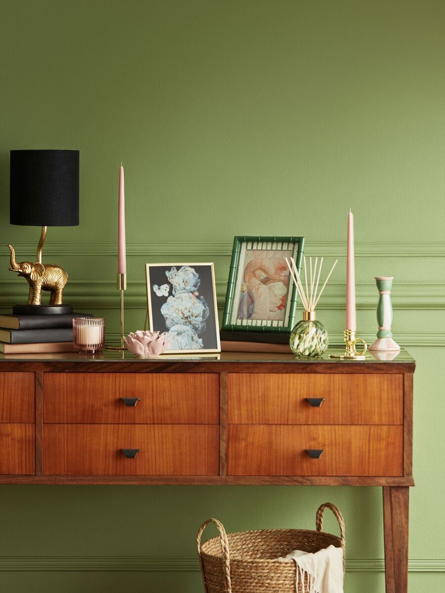
“In living and dining spaces rich tones like forest green and browns paired with a statement sofa, accent chairs or a plush rug sets a warm grounding foundation. For bedrooms, softer tones like muted burgundy, plum or deep ochre can be introduced through bedding, cushions or throws, creating a snug, cocoon-like atmosphere perfect for the colder months.” For anyone who might not relish getting out the paint brushes, accessories can introduce seasonal colours with ease, particularly much-need textiles for this time of year. For Lesley, it’s throws, cushions and rugs.

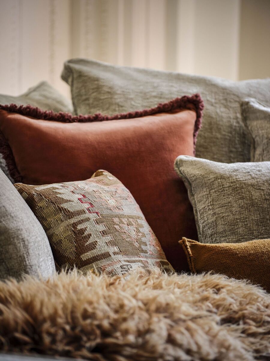
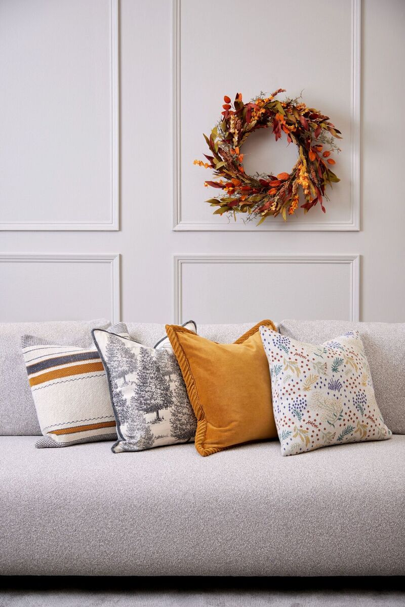
“A mix of velvet and linen cushions in earthy and jewel tones can instantly warm up a neutral sofa,” she says. “Upholstered furniture, like a statement armchair or ottoman in a rich, autumnal fabric, can also be a great addition. You can also play with smaller accessories such as vases, artwork or ceramic pieces to subtly introduce these colours. Layering different textures in the same colour family adds depth and interest without overwhelming the space.”
When committing to a wall colour and the element of semi-permanence it brings, Aoife Doyle, colour consultant at The Colour Hub, says it’s important to think ahead and how you’ll feel about new additions for the current season next spring and summer.
“Some paint shades work season after season and can be enhanced and elevated with oranges, plums, browns and deeper ochre tones at this time of year,” says Aoife. “They can also be reimagined come spring to feel lighter and more vibrant by combining them with energetic powder blues, sunshine yellow and aqua accessories.”
Sometimes, however, committing to a paint colour if you’re incurring the expense of hiring a decorator might make it a worthwhile exercise to get a colour consultation. “Finding the ideal colours to suit your home can be overwhelming,” says Aoife. “There has never been such a wide range of colour choices available from so many paint brands. It can be difficult to translate what you are inspired by into a feeling that works well in each room of your home, while at the same time ensuring it all works together. Our job is to listen to what our clients love and what kind of atmosphere they dream of creating.”

Regina Rogers, proprietor of Regina Rogers Design, says, “Clients come to me mainly for a colour scheme for an entire house before they commence an interior project or after a renovation. The thing to remember is that paint not only brings the final layer to a design but also creates a flow from one space to another, connecting rooms. It frames unusual features, enhances ceiling heights and architectural shapes, sets a mood within a space and it’s the most economical way to transform a space.” For anyone uncertain about committing to a distinctive all-over colour, Regina suggests a smaller-scale approach.

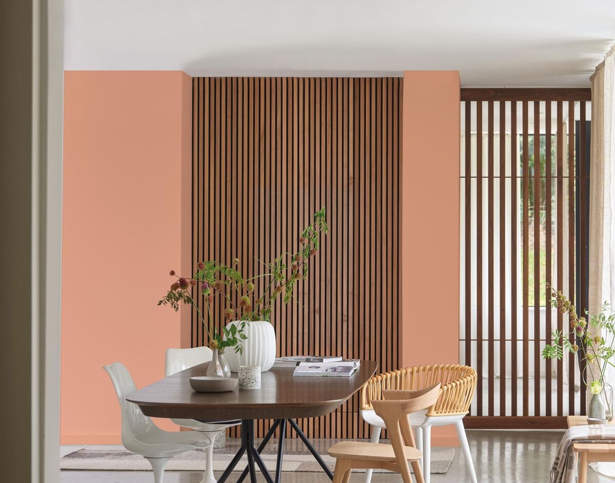
“If you love a colour but are wary of how it will influence the mood of the room use it on a feature wall. This can be changed easily enough, or introduce a fleck within soft furnishings. The key to using a distinctive colour is the layer you add once applied.
“This allows the perfect balance of colour; a distinctive coloured wall with a warm neutral to complement it. Then adding soft furnishings like cushions, curtains that draw down on the distinctive colour with small flecks within the fabric.”
When approaching the design of any space she also looks to find the perfect balance between contrasting colour, pattern and texture. “I tend to create the design in layers,” says. “A substantial amount of distinctive colour needs a counterbalance; the colours, texture and lighting are what create a mood. Add coloured layers and texture through fabrics, rugs, curtains, and furniture finishes. Mixing soft fabrics like velvet or wool with hard surfaces creates a tactile and visually interesting space.”
- Instagram.com/reginarogersdesign
- Instagram.com/5thwallinteriors
- Instagram.com/templeoguedecor

